By Josh Tullis on April 23, 2020
Seven out of 32 teams will wear new or modified uniforms when the 2020 NFL season (hopefully) kicks off in September. In an off-season riddled with uncertainty and high-profile personnel changes in some cities (sorry New England), it’s only fitting that the NFL and Nike give us some new material to occupy our thoughts while we pray to the football Gods for a September 10th coin-flip in Kansas City.
Let’s take a look at each of these changes and grade them from a uniform-nerd’s perspective:
Los Angeles Chargers

Tampa Bay is lucky that these uniforms weren’t revealed before Tom Brady made his decision. Last year we finally saw a primary shift to the iconic powder blue look that fans had been obsessing over for decades. Unfortunately, it seems Chargers fans abandoned ship in droves as abruptly as the team abandoned San Diego. If any fickle free-agent football fans are looking to base their 2020 bandwagon-jump on looks, the Chargers are the no doubt clear-cut winners of the off-season beauty pageant.
2020’s uniform spread focuses on a cohesive look from top to bottom, with simplified bolt designs and a noticeable departure from the over-loaded color palette of the past. Instead, they’ve maintained ownership of each shade of blue with clean, separate looks that somehow both match perfectly and stand tall independently.
Grade: A+
Tampa Bay Buccaneers
![We're still fond of the Bucs' new threads, but they're not quite at the top of the NFL when it comes to uniform redesigns. [Tampa Bay Buccaneers]](https://arc-anglerfish-arc2-prod-tbt.s3.amazonaws.com/public/WUBJ5RZIH5CMXBN5DKUOSMJULM.jpg)
No – the Creamsicles aren’t back (yet). But fans of the Buccaneers are likely to keep their uniform grievances to themselves as they enjoy the most optimistic off-season in nearly two decades. BA and the bunch should feel twice as fortunate to not only win the TB12 sweepstakes (complete with Gronk accessory), but to enter this new era with a classic, revamped look that replaces their modern-robotic, illegible uniform design.
Perhaps it’s just modern photography or the Nike touch, but this remake of the Mike Alstott-era Buccaneers uniform should have us questioning why they ever changed them in the first place. Nike’s take on Pewter works very well as both a primary color and as a secondary to their red that doesn’t interfere with the black contours and black trim. Subtle notes of the famous Bay Orange are reserved for number detail and pant trim as opposed to being shoved into fabric inserts. The absence of orange in the all-pewter look shows a willingness to not shove every color on the palette into every design, a welcome philosophy change that leaves some future alternate looks in the hopper. The helmet decals have been slightly reduced in size, yet still entirely too large. Regardless, Tampa Bay knocked this one out of the park and continues their off-the-field winning streak.
Grade: B+
Atlanta Falcons

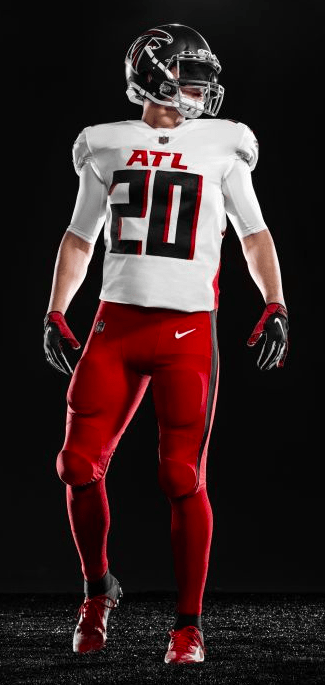
Undoubtedly, the Falcons were in desperate need for a change from the awkward color-blocking and over-thought number font that first debuted on 2003’s arena-esque look. At the time, the new look was viewed as a radical change from their classic solid-color look made famous by Jamaal Anderson and the timeless “Dirty Bird Dance“, with the new Falcon logo being the only universally well-received change.
The refreshed 2020 look is a near-complete overhaul, no longer relying on piping and color-blocking to add over-the-top features to an already bold color palette. The simplicity of the understated red side panels is a clean look that works well with all black/white top and bottom combinations. Even the faded red-to-black jersey takes care not to add too much visual stimulation while still offering a distinct yet fully-cohesive setup.
“ATL” prominently displayed on the front of the primary looks is a bit of a reach for “cool” points, while the contrasting shadow numbers only make the unique font harder to read. Add the alternate red pants into the mix and you have a visual mess that is too option-focused. The saving grace of this release is the throwback look, complete with alternate Falcon helmet decal and matching shoulder detail. Three-stripe pants and standard full-block numbers are the best look in the teams 50+ year history; hopefully they give us a matching throwback white jersey in the future and send the “ATL” kits packing.
Grade: C
New England Patriots

Is it a coincidence that the Navy/Silver Patriots uniforms debuted during Tom Brady’s rookie year, and were subsequently retired after his last season in New England? It seems wholly appropriate to close this dynastic chapter of Patriots history with the retirement of the winningest uniform in NFL history (*AngrySteelersFan79 has entered the chat*).
Unlike the other big uniform upgrades coming in 2020, the classically-conservative Patriots are simply promoting their navy-on-navy Color Rush look to primary status. From 1960 to 1992, shoulder striping was a hallmark of the Boston/New England on-field look, so it
/cdn.vox-cdn.com/uploads/chorus_image/image/66553331/154839575.jpg.0.jpg)
should come as no surprise to true Patriots fans that the distinct detailing is making a comeback. Navy Blue as a primary color when detailed with scarlet accents always results in a clean, easy-on-the-eyes, patriotic look as long as white is used as the main contrasting color. These home uniforms continue to convey a professional, buttoned-up look, perhaps more than the 2000/2010’s uniforms. The new away jersey however is a puzzling, lazy offering that looks as though designers clicked the “randomize” button in their design program. The Red-Navy-Red arrangement on the shoulder stripe doesn’t fit well with the number coloring nor does it complement the singular pant option that works so well with the home jersey. The late 80’s/early 90’s white jerseys at least broke the dark-on-dark striping up with thin white lining. Any emphasis on the color red within the Patriot scheme should be reserved for the iconic red-top uniforms of the 60’s, 70’s, 80’s and early 90’s. While uninventive, the navy set still scores points – but the white jerseys need fixing as soon as possible.
Grade: C–
Cleveland Browns

The Cleveland Browns for decades have been the Masters of Mishap, authoring chapter and verse on what not to do when trying to build a winning sports franchise. With a list of misfortunes longer than the list of starting quarterbacks since 1999, the one aspect of the Browns that wasn’t ranked 32 out of 32 was their classic uniform look that dates back to the Jim Brown era. Like clockwork, this last bastion of positivity eventually proved equally susceptible to the oft-overthinking Browns brain-trust and their poor decision making skills. Cleveland’s 2015 uniform overhaul introduced us to a radical, over-modernized busy arrangement, appropriately comparable to what an over-hyped FCS-level college program would wear.
Thankfully someone in Cleveland realized that it’s time to unfix what wasn’t broken, and bring back the timeless look that has defined the Browns since their inception in 1946. Brown and Orange is a surprisingly symbiotic color combination that works in almost any striping arrangement. Never again should there be any less than five stripes on the

shoulder of a Browns uniform, as few teams could pull off the look this effortlessly. The uniqueness of the color combination negates the need for a team name, especially on pants (something no team should ever try again). The one decent look from last year, the all-brown Color Rush alternate, is worthy of inclusion as an alternate to the primary setups as long as they maintain the solid orange decoration and resist throwing white into the mix. We know however, that nothing is sacred in Cleveland.
Grade: B-
Indianapolis Colts
Nothing newsworthy has come out of Indianapolis since Andrew Luck shocked the professional football world and hung up the cleats after the 2018 season. In appropriately quiet fashion, the Colts will roll out minor updates to their standard Royal and White branding. Only those looking closely will notice the number font change, meant to match the old uniform numbers from the 50’s and 60’s. A new secondary logo with a questionable origin story will also appear randomly and seemingly stay out of sight on actual player gear. But wait! A new color – “Anvil Black” – has been introduced into the color scheme, and used ONLY in the Nike swoosh on the white away uniforms. Yawn.
Grade: D+
Bonus: Los Angeles Rams
EDIT: The 2020 Rams uniforms earned an entire post of their own – find it here.
On the plus side, shifting to Royal and Gold primary colors finally sheds all the confusion that has surrounded the Rams identity over the past decade or so. On the negative side, ANY uniform combination that they release will fail to live up to the standard set by the Chargers’ new 2020 threads. There’s a good chance someone on the Rams design team caught a glimpse of the Chargers uniforms before they went public, and took their concepts back to the drawing board. We’ll revisit this once the Rams uniforms drop.
Grade: TBD

i disagree, colts new unis are $ and a subtle get nice change for the same old same old
LikeLike
Good job. Agreed. Chargers color scheme going to be fun to watch each week.
LikeLike
Well played!
LikeLike
Well played!
LikeLike
Pingback: Review: LA Rams Uniforms Arrive Last…and Least – Geared Up