
The branding rollercoaster continues to twist and turn in unison with the LA Rams’ on-field performance, as fans had little time to heal from the disappointing end of the 2019 season before taking another hit, this time in the form of their freshly-released 2020 uniforms.
The uniform history of the Rams is a kaleidoscope of mismatching blues and golds, with some white and even some red thrown into the mix. Just as we tend to forgive the our parents for some pretty questionable style decisions throughout the 70s and 80s, all franchises deserve a pass for their outlandish looks of the past. As organizations modernize, and as the NFL brand and it’s teams skyrocket in value, it’s bewildering that decision-makers at the head of multi-billion dollar franchises can almost predictably allow changes to branding that are universally panned by their fans.
If you took the time to read my review of the other 2020 uniform drops, you’ll know who’s revamped look is my top-rated of the bunch—the Los Angeles Chargers. How convenient is it that the best new look in the league will be sharing the same new stadium as the Rams? It’s unfortunate that the two franchises didn’t share the same uniform designers as well. At first look you may think that the new styles may have been a collaborative effort, but a closer examination of the Rams’ release tells a very different story. The City of Angels is now officially the city of Blue and Gold, but one team’s execution vastly pales in comparison to the other’s.
Helmets

The Rams swirling helmet design is in the pantheon of highly-recognizable sports motifs with the likes of Michigan’s helmet wings, Dallas’ Star and the USC Trojan head. In a world where attempts at “cool” are too often accompanied by over-complication, the classic Rams horns that have adorned their helmets since 1948 should’ve been off-limits. Instead, the designers chose to hit the reset button on over 70 years of brand recognition, replacing the old solid horns with a segmented, questionably-shaped design that Eric Dickerson likened to “two bananas” (hard to un-see them now right?). Even throughout the back-and-forth between white and two shades of gold over the last decade, the horns themselves never lost their resonance with the fan base I’m afraid the new banana/crescent moon horns are a complete miss.
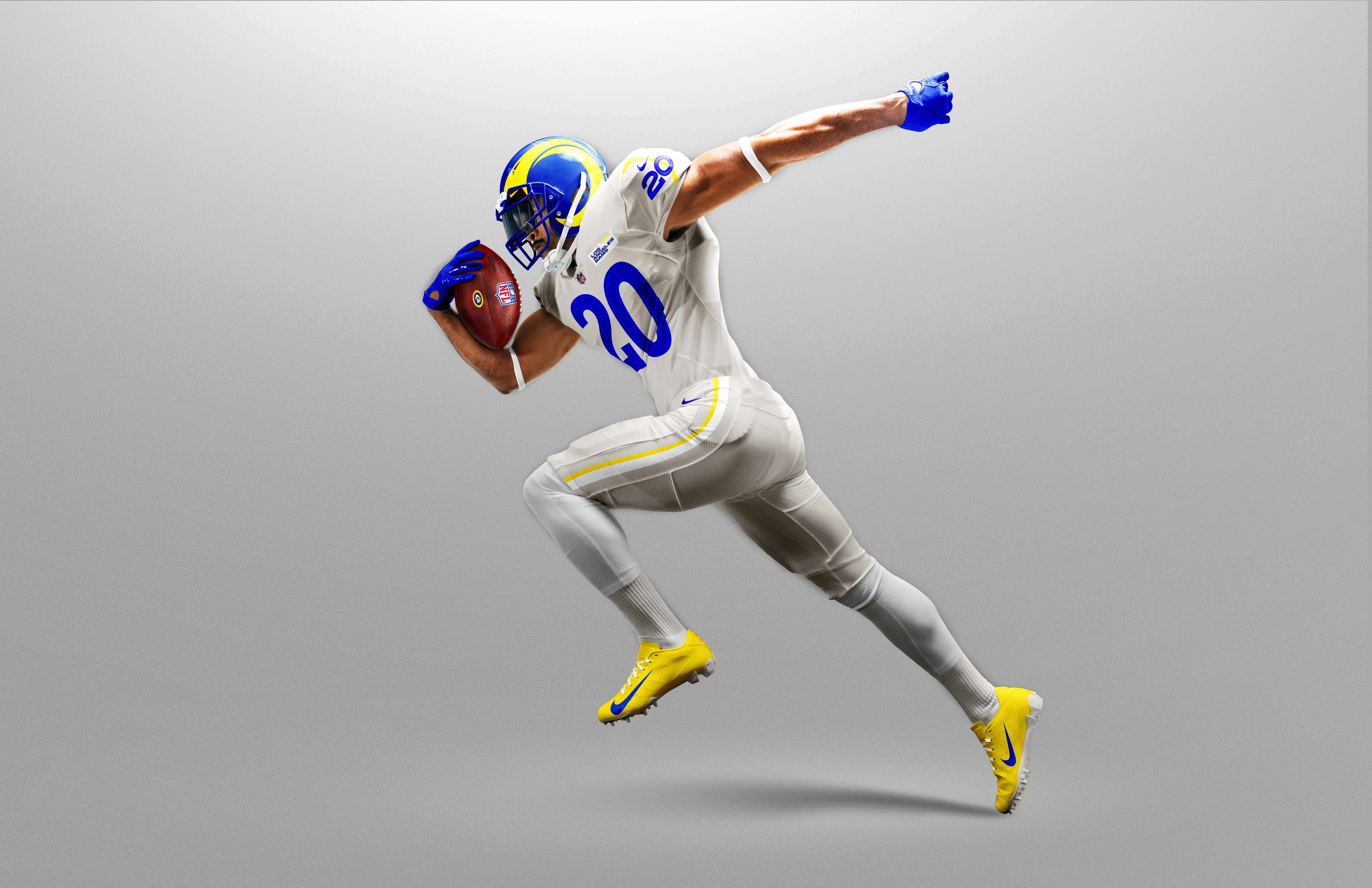
Jerseys
For those of a certain generation, the Rams are one of few franchises that are easy to associate with multiple cities. From Los Angeles to St. Louis and back to Los Angeles, the Rams’ identity is rooted more in their aesthetics than their physical surroundings. It’s this reliance on their visual identity that’s been totally disregarded in the design process of the 2020 uniforms.
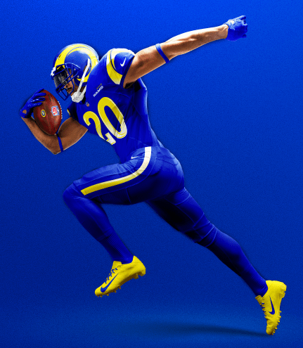
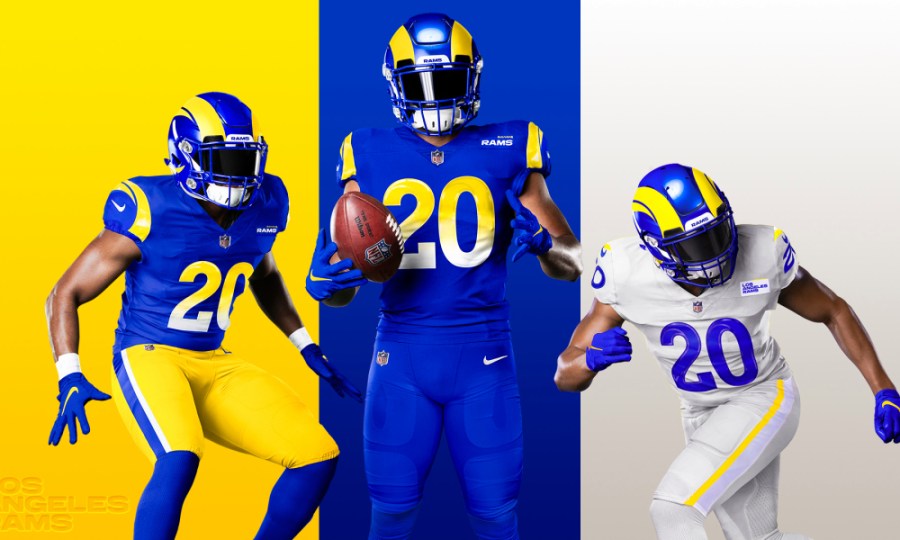
Before lobbing any further criticisms, they did absolutely nail the color scheme, as royal and yellow is the unquestioned fan-favorite among their many recognizable combos. No longer will we see any of the dark blue or light gold colors made famous by The Greatest Show on Turf. Unfortunately what we will see is a rather unimaginative and disconnected offering, starting with their “Rams Royal” top and bottom set. The color on it’s own is visually-stimulating enough without the use of these gimmicky two-color faded numbers that fail to connect with any bit of franchise history. At the very least, if they wanted to use a gradient within the numbers, they could’ve combined old and new by maintaining the bold block numbers of the past. Big, solid yellow numbers would’ve served these jerseys perfectly well.
The new horn design adorns not only the helmet, but also the shoulders of the jersey, where it could easily be mistaken for some random, modernized shape other than a ram’s horn. The two yellow swipes of color surround the Nike swoosh like a bad tribal tattoo. On second thought, maybe they’re waves? A quick color swap would quickly create a look appropriate for the Rainbow Warriors of Hawai’i or Tulane’s Green Wave.
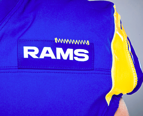
Maybe the confusion surrounding the shoulder design explains the unflattering use of a team name patch on the upper-left chests of the jerseys. I’m not sure if these were inspired by military uniforms or by the advertising patches we now see on NBA uniforms but YIKES – even the new-and-unimproved Rams head logo would’ve been a nicer touch than these. Maybe these were the labels the design teams were using to make sure they don’t mistake these jerseys for the Chargers designs as they were replicating them. This is yet another element of the uniform that doesn’t connect well with Rams tradition, nor is it very functional as an identifying feature due to it’s size.

I’m all for making a decision and going all-in on it, so I’m going to cut the design team some slack for hastily matching the side panel of the royal pants to the yellow/white gradient numbers. I’d contest however that this would’ve been a great location and opportunity to somehow connect with 70+ years of Rams history, rather than taking the easy way out. The execution of the gold pants (which are…fine) should’ve simply been color-changed to create the royal set, or perhaps a solid yellow wave-like pattern could’ve been added here to match the shoulders and the helmet decals.
With the massive departure from a traditional look on the royal/yellow set, it would only make sense that their light uniform offering would inspire some degree of nostalgia for the Rams-faithful. Sorry Ram-fam, you’re out of luck.
The story behind a uniform is half the battle when it comes to fan acceptance and acclaim. A fledgling league like the XFL was a safe place for uniform experimentation as brand new fans valued visual stimulation over lore. It’s safe to say the 2020 version of the XFL exhausted every effort to avoid creating a brand connection with their failed 2001 product. With 100 years of history, the NFL doesn’t have the luxury of operating with a blank slate when it comes to uniforms and logos – the Rams don’t care.
The Los Angeles Rams will not compete in white uniforms during the 2020 NFL season. Instead, they will wear an exclusive color called “Bone”, an off-white shade that looks more like a light grey than anything seen on National Geographic. The inspiration for the color is said to be in the coloring of actual ram horns, but anyone with the internet can quickly compare these jerseys to wildlife photos and realize the huge disparity between the colors. The color of real-life ram horns isn’t white or yellow either, so introducing yet another color into the mix isn’t so out of the ordinary for this group. The bigger issue is the selling of a story that just doesn’t quite make sense.

Their yellow (“Sol”) has a tough time distinguishing itself from the Bone color, calling into question why they didn’t use royal in the contrasting accents on the jersey shoulders and pant side panels. Color aside, the thinned-out swirl design on the shoulders faces backwards if the intention indeed was to imitate a ram horn. My guess is that this away design rendered in white looked too much like some other NFL teams since white and blue is a fairly common color-scheme, but there had to be another way to make the details pop more. The Bone pants can’t be worn with the blue tops, and the yellow pants shouldn’t be worn with the Bone tops. Meanwhile, the blue pants have the gradient on the sides that doesn’t make sense with the Bone tops either. We’re going to get over the Bone on Bone look very quickly, and the inability to mix-and-match the sets is disappointing to say the least. How about some bone-colored helmet decals when they break this set out? Since, you know, they’re supposed to be ram horns and not bananas.

The team name tags on the Bone jerseys are white instead of Bone or royal…even yellow would’ve made more sense than deciding to make this small of an element the ONLY white piece on the jersey. The James Bond gun barrel pattern inside the numbers isn’t awful, it’s just overkill on an overall design scheme with too many elements to browse through.
Let’s hope this year counts towards the five-year waiting period for uniform reboots, regardless of whether teams play in the fall or not. And maybe they should let Eric Dickerson into the design room this time – he seems to be the last person on Earth who knows what Rams history is all about.
Grade: D+
See reviews of the other new NFL Uniforms here.
