Reviews, Notes and Opinions on the Forever Evolving Sportswear Industry by Josh Tullis
Author: Josh Tullis
Josh Tullis is a sportswear industry professional focused on creating relationships with athletic organizations and academic institutions who value a more holistic approach to the management of their brand while addressing the tangible needs of their athletes.
From right place, right time to wrong place, worst time – UCLA finds itself a free agent in the sports apparel market with less leverage and less available cash than ever.
2016’s 15-year/$280-million agreement between UCLA and Under Armour was the largest apparel deal in the history of college athletics, establishing UCLA as UA’s west-coast flagship program and giving effective, coast-to-coast visibility for the Under Armour brand. Included in the deal was an up-front payment of $15-million, $11-million annually in marketing fees, $2-million for facility upgrades and $7.4-million in UA apparel, footwear and equipment. Yesterday, only days before year-four of the agreement would officially begin, UA decided to officially terminate the agreement.
UCLA’s marquee sports have yet to deliver results worthy of the most valuable apparel deal in the country.
Under Armour is claiming a breach of the contract, citing the lack of “marketing benefits” that the company is contractually entitled to throughout the lifetime of the agreement. Skeptical minds will certainly land on other possible catalysts for the brand’s decision to end their highest-profile collegiate partnership.
UCLA and Under Armour aren’t alone in their recent struggles in navigating difficult economic circumstances during the worst pandemic of our lifetimes. The sportswear industry as a whole has seen dramatically reduced sales throughout the second quarter, leaving them in a scramble to reduce costs and batten down the hatches as we come to grips with another potential shut-down of athletic activities this fall.
Now that Under Armour is out on the Bruins, we can expect to see a miniature bidding war for the sponsorship rights of the still undeniably valuable and historic west-coast staple. While the finance blogs crunch numbers, let’s take a look at some possible uniform looks for UCLA football from the other top sportswear brands:
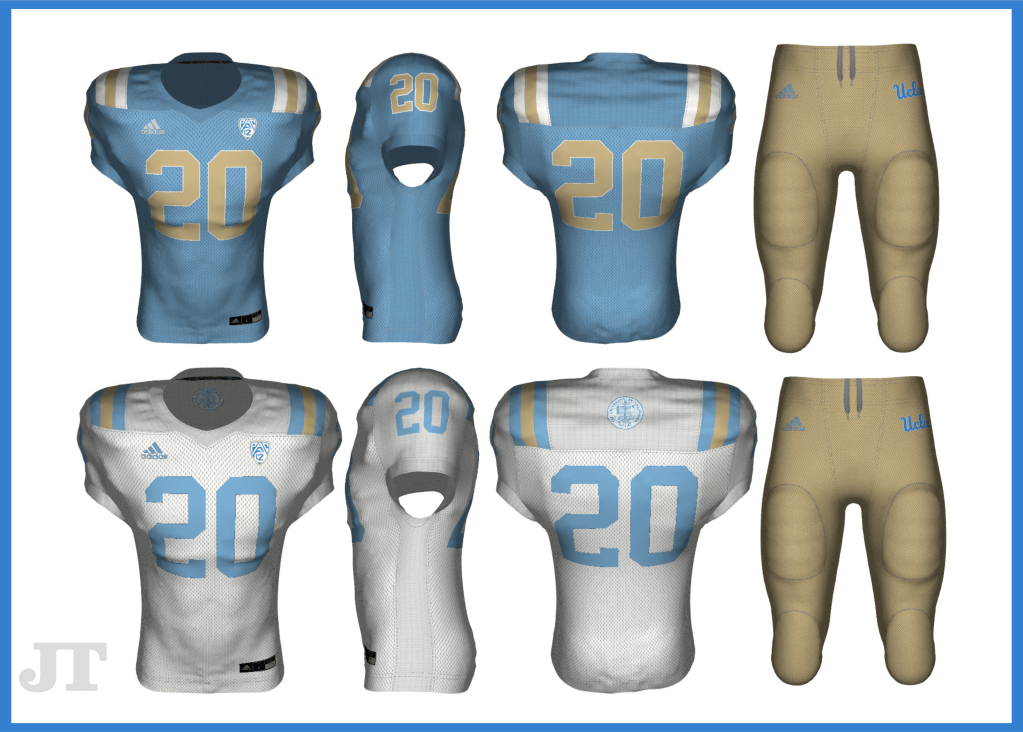
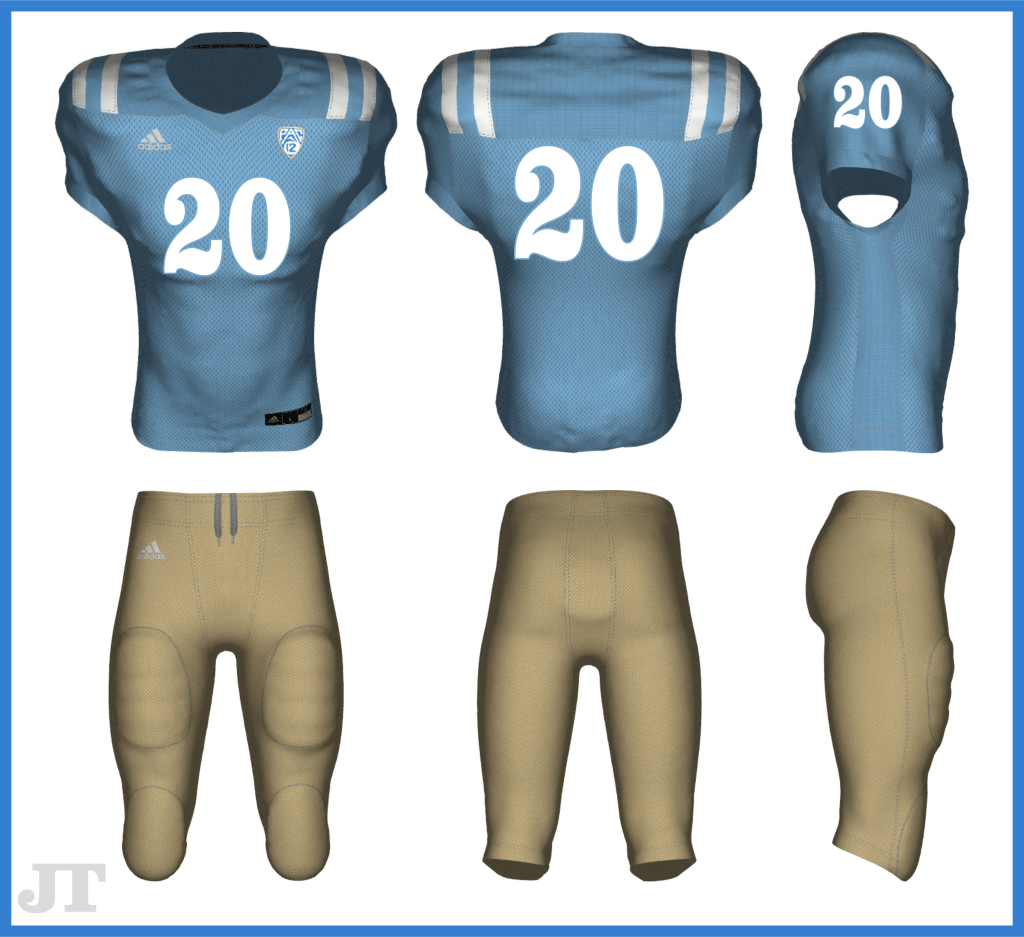
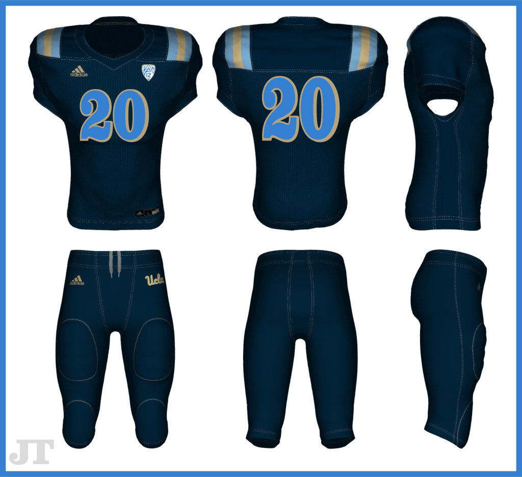
Adidas
Hell hath no fury like a corporation scorned. Even after UCLA’s three-year affair with Under Armour, most casual college athletics fans most likely still find the Adidas brand the most synonymous with Bruins athletics. For 18 years, UCLA exclusively wore the Three Stripes and had been treated as a premier college partner for the brand with marketing efforts comparable to long-time Adidas schools like Louisville and Kansas.
It’s unclear just how much love was lost after their breakup, but it should prove relatively painless for Adidas to pick up where they left off in executing the school’s branding if both parties can rekindle the flame. Here are some potential UCLA x Adidas football looks:
A hasty, traditional conversion back to Adidas Techfit Uniforms. The University’s seal is shown on the back yoke of the white jerseys. 1967 Powder Blue Throwbacks, featuring the popular Clarendon numbers of past UCLA uniforms.The once popular “L.A. Nights” alternate uniform in the updated Adidas fabrication, once again featuring Clarendon numbers, this time with shadowing.
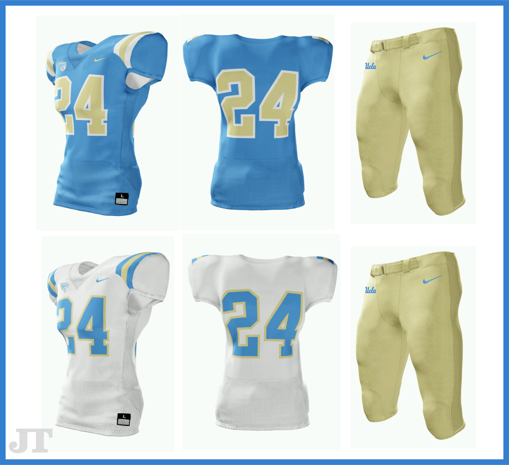
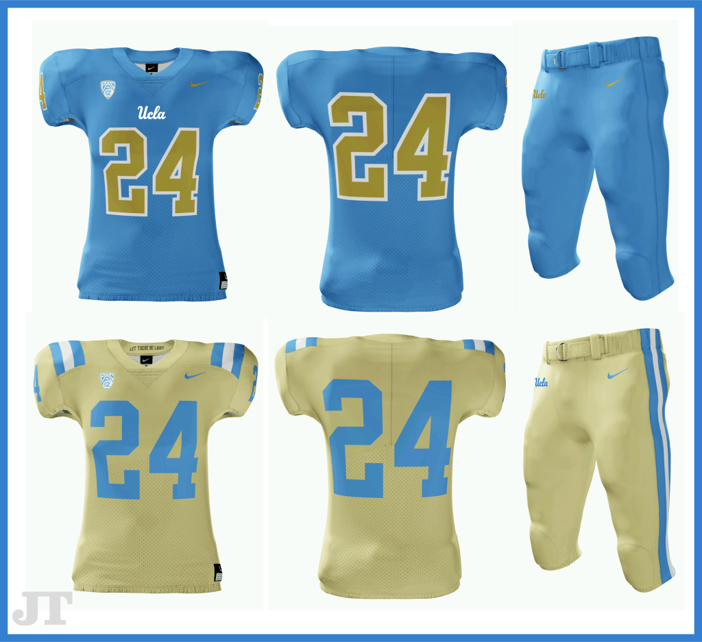
Nike
Nike is the dominant brand among PAC-12 Schools, outfitting seven out of the twelve member institutions. After Washington University’s decision to end a 20-year relationship with Nike and sign with Adidas in 2018, the market-share leader may have interest in reallocating those resources at a considerable and justifiable discount. An underlying revenge plot exists as well, since Under Armour had poached UC-Berkeley from Nike at the same time it had romanced UCLA away from Adidas. Here are some potential UCLA x Nike football looks:
The standard look is quickly achievable with Nike Vapor Pro uniform, with the classic UCLA striping closer to wrapping all the way around than the Adidas styles had.Nike’s top of the line Vapor Untouchable Uniform designed as “Color Rush” alternates. Metallic Gold Satin Twill numbers on the blues may be the closest anyone has come to matching the helmet’s gold color ever. The all-gold look is sure to be rejected by traditionalists and Colorado Buff haters.
Wildcard: Jordan Brand
Here’s a fun fact left out of the recent Michael Jordan documentary: MJ wanted to be a Bruin. The entire landscape of sports apparel could’ve been majorly different if UCLA had simply tried harder to recruit Jordan, and their uncertain branding future would’ve most likely been avoided had the GOAT been an alumnus this whole time.
Now that we have a handful of football-centric schools wearing Jordan on the gridiron, it’s not inconceivable that UCLA could end up as the first Jordan+Nike school in the PAC-12. It might be a tough sell to Nike themselves since they’ll likely want to keep the uniform spotlight on the University of Oregon, but in this climate, who knows?
“Horns Forward”, Thumbs Downward [Los Angeles Rams]
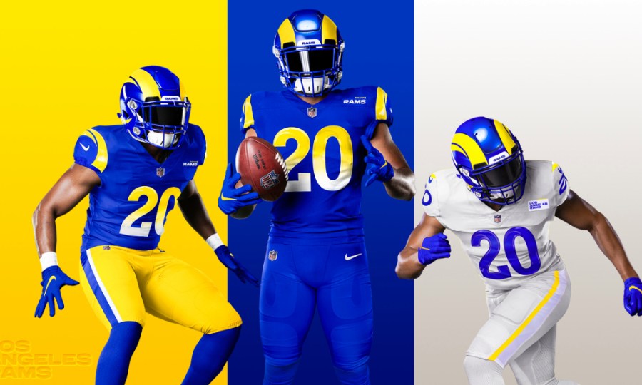
The branding rollercoaster continues to twist and turn in unison with the LA Rams’ on-field performance, as fans had little time to heal from the disappointing end of the 2019 season before taking another hit, this time in the form of their freshly-released 2020 uniforms.
The uniform history of the Rams is a kaleidoscope of mismatching blues and golds, with some white and even some red thrown into the mix. Just as we tend to forgive the our parents for some pretty questionable style decisions throughout the 70s and 80s, all franchises deserve a pass for their outlandish looks of the past. As organizations modernize, and as the NFL brand and it’s teams skyrocket in value, it’s bewildering that decision-makers at the head of multi-billion dollar franchises can almost predictably allow changes to branding that are universally panned by their fans.
If you took the time to read my review of the other 2020 uniform drops, you’ll know who’s revamped look is my top-rated of the bunch—the Los Angeles Chargers. How convenient is it that the best new look in the league will be sharing the same new stadium as the Rams? It’s unfortunate that the two franchises didn’t share the same uniform designers as well. At first look you may think that the new styles may have been a collaborative effort, but a closer examination of the Rams’ release tells a very different story. The City of Angels is now officially the city of Blue and Gold, but one team’s execution vastly pales in comparison to the other’s.
Helmets
A design Sailor Moon would be proud of. [Los Angeles Rams]
The Rams swirling helmet design is in the pantheon of highly-recognizable sports motifs with the likes of Michigan’s helmet wings, Dallas’ Star and the USC Trojan head. In a world where attempts at “cool” are too often accompanied by over-complication, the classic Rams horns that have adorned their helmets since 1948 should’ve been off-limits. Instead, the designers chose to hit the reset button on over 70 years of brand recognition, replacing the old solid horns with a segmented, questionably-shaped design that Eric Dickerson likened to “two bananas” (hard to un-see them now right?). Even throughout the back-and-forth between white and two shades of gold over the last decade, the horns themselves never lost their resonance with the fan base I’m afraid the new banana/crescent moon horns are a complete miss.
Jerseys
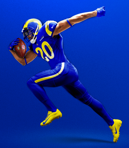
For those of a certain generation, the Rams are one of few franchises that are easy to associate with multiple cities. From Los Angeles to St. Louis and back to Los Angeles, the Rams’ identity is rooted more in their aesthetics than their physical surroundings. It’s this reliance on their visual identity that’s been totally disregarded in the design process of the 2020 uniforms.
[Los Angeles Rams]
Before lobbing any further criticisms, they did absolutely nail the color scheme, as royal and yellow is the unquestioned fan-favorite among their many recognizable combos. No longer will we see any of the dark blue or light gold colors made famous by The Greatest Show on Turf. Unfortunately what we will see is a rather unimaginative and disconnected offering, starting with their “Rams Royal” top and bottom set. The color on it’s own is visually-stimulating enough without the use of these gimmicky two-color faded numbers that fail to connect with any bit of franchise history. At the very least, if they wanted to use a gradient within the numbers, they could’ve combined old and new by maintaining the bold block numbers of the past. Big, solid yellow numbers would’ve served these jerseys perfectly well.
[Los Angeles Rams]
The new horn design adorns not only the helmet, but also the shoulders of the jersey, where it could easily be mistaken for some random, modernized shape other than a ram’s horn. The two yellow swipes of color surround the Nike swoosh like a bad tribal tattoo. On second thought, maybe they’re waves? A quick color swap would quickly create a look appropriate for the Rainbow Warriors of Hawai’i or Tulane’s Green Wave.
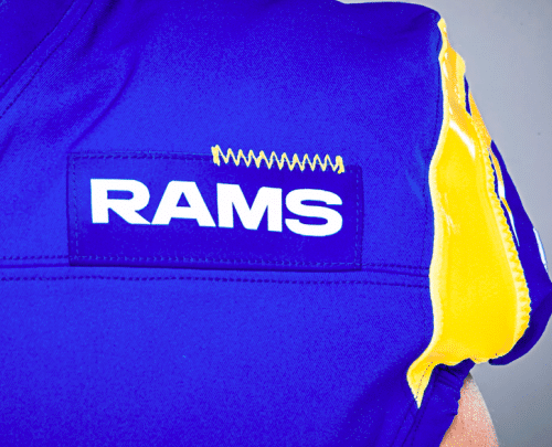
“Hello – My Name Is:” [Los Angeles Rams]
Maybe the confusion surrounding the shoulder design explains the unflattering use of a team name patch on the upper-left chests of the jerseys. I’m not sure if these were inspired by military uniforms or by the advertising patches we now see on NBA uniforms but YIKES – even the new-and-unimproved Rams head logo would’ve been a nicer touch than these. Maybe these were the labels the design teams were using to make sure they don’t mistake these jerseys for the Chargers designs as they were replicating them. This is yet another element of the uniform that doesn’t connect well with Rams tradition, nor is it very functional as an identifying feature due to it’s size.
[Los Angeles Rams]
I’m all for making a decision and going all-in on it, so I’m going to cut the design team some slack for hastily matching the side panel of the royal pants to the yellow/white gradient numbers. I’d contest however that this would’ve been a great location and opportunity to somehow connect with 70+ years of Rams history, rather than taking the easy way out. The execution of the gold pants (which are…fine) should’ve simply been color-changed to create the royal set, or perhaps a solid yellow wave-like pattern could’ve been added here to match the shoulders and the helmet decals.
With the massive departure from a traditional look on the royal/yellow set, it would only make sense that their light uniform offering would inspire some degree of nostalgia for the Rams-faithful. Sorry Ram-fam, you’re out of luck.
The story behind a uniform is half the battle when it comes to fan acceptance and acclaim. A fledgling league like the XFL was a safe place for uniform experimentation as brand new fans valued visual stimulation over lore. It’s safe to say the 2020 version of the XFL exhausted every effort to avoid creating a brand connection with their failed 2001 product. With 100 years of history, the NFL doesn’t have the luxury of operating with a blank slate when it comes to uniforms and logos – the Rams don’t care.
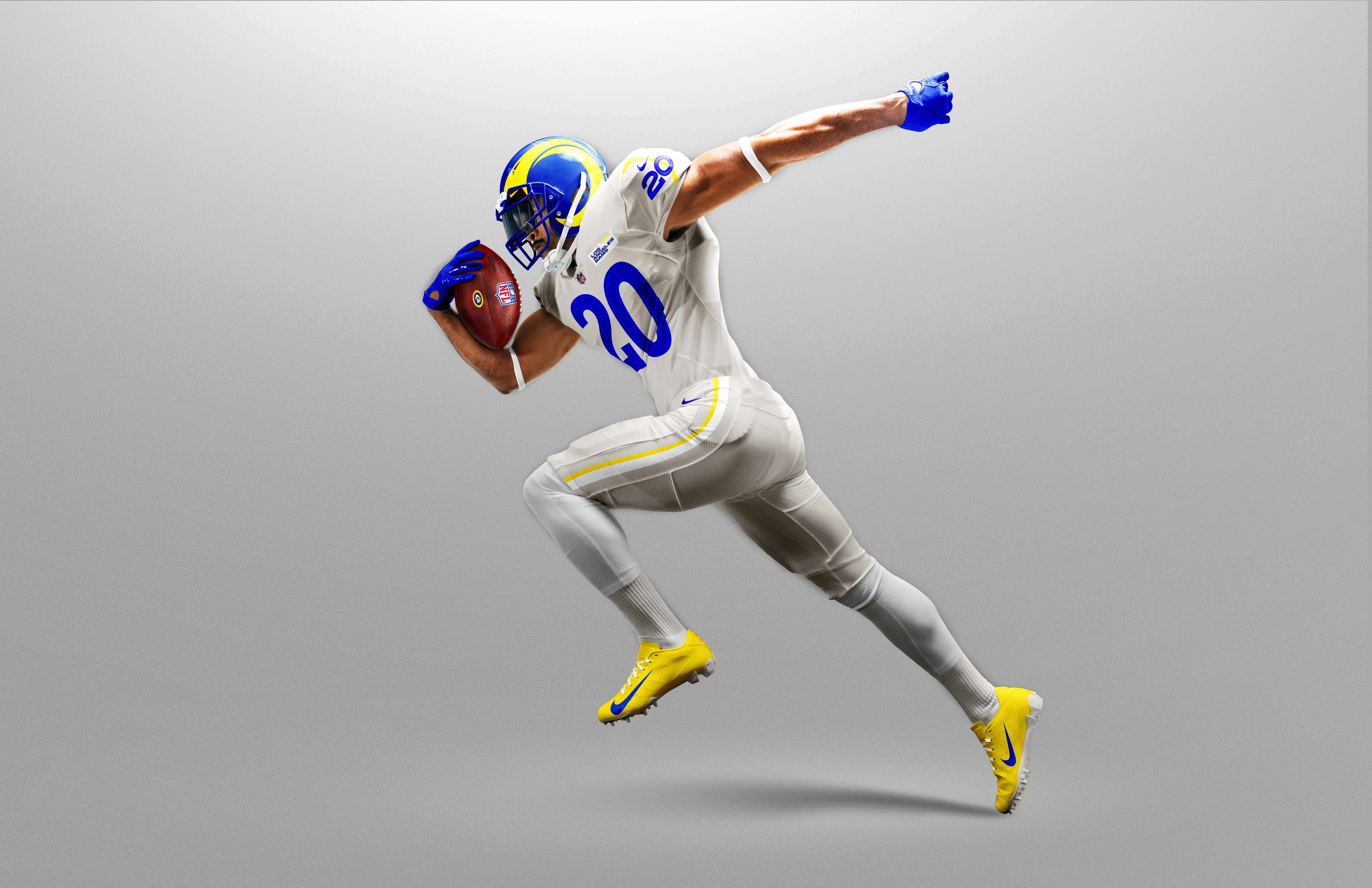
Bad to the “Bone” – not in the good way. [Los Angeles Rams]
The Los Angeles Rams will not compete in white uniforms during the 2020 NFL season. Instead, they will wear an exclusive color called “Bone”, an off-white shade that looks more like a light grey than anything seen on National Geographic. The inspiration for the color is said to be in the coloring of actual ram horns, but anyone with the internet can quickly compare these jerseys to wildlife photos and realize the huge disparity between the colors. The color of real-life ram horns isn’t white or yellow either, so introducing yet another color into the mix isn’t so out of the ordinary for this group. The bigger issue is the selling of a story that just doesn’t quite make sense.
Go figure – the gold from the St. Louis days may be the closest they’ve been to matching actual ram horns.
Their yellow (“Sol”) has a tough time distinguishing itself from the Bone color, calling into question why they didn’t use royal in the contrasting accents on the jersey shoulders and pant side panels. Color aside, the thinned-out swirl design on the shoulders faces backwards if the intention indeed was to imitate a ram horn. My guess is that this away design rendered in white looked too much like some other NFL teams since white and blue is a fairly common color-scheme, but there had to be another way to make the details pop more. The Bone pants can’t be worn with the blue tops, and the yellow pants shouldn’t be worn with the Bone tops. Meanwhile, the blue pants have the gradient on the sides that doesn’t make sense with the Bone tops either. We’re going to get over the Bone on Bone look very quickly, and the inability to mix-and-match the sets is disappointing to say the least. How about some bone-colored helmet decals when they break this set out? Since, you know, they’re supposed to be ram horns and not bananas.
The new patches look perfect…for a CFL team. [Los Angeles Rams]
The team name tags on the Bone jerseys are white instead of Bone or royal…even yellow would’ve made more sense than deciding to make this small of an element the ONLY white piece on the jersey. The James Bond gun barrel pattern inside the numbers isn’t awful, it’s just overkill on an overall design scheme with too many elements to browse through.
Let’s hope this year counts towards the five-year waiting period for uniform reboots, regardless of whether teams play in the fall or not. And maybe they should let Eric Dickerson into the design room this time – he seems to be the last person on Earth who knows what Rams history is all about.
Seven out of 32 teams will wear new or modified uniforms when the 2020 NFL season (hopefully) kicks off in September. In an off-season riddled with uncertainty and high-profile personnel changes in some cities (sorry New England), it’s only fitting that the NFL and Nike give us some new material to occupy our thoughts while we pray to the football Gods for a September 10th coin-flip in Kansas City.
Let’s take a look at each of these changes and grade them from a uniform-nerd’s perspective:
Los Angeles Chargers
Why choose one shade of blue when you can have them all? [Los Angeles Chargers]
Tampa Bay is lucky that these uniforms weren’t revealed before Tom Brady made his decision. Last year we finally saw a primary shift to the iconic powder blue look that fans had been obsessing over for decades. Unfortunately, it seems Chargers fans abandoned ship in droves as abruptly as the team abandoned San Diego. If any fickle free-agent football fans are looking to base their 2020 bandwagon-jump on looks, the Chargers are the no doubt clear-cut winners of the off-season beauty pageant.
2020’s uniform spread focuses on a cohesive look from top to bottom, with simplified bolt designs and a noticeable departure from the over-loaded color palette of the past. Instead, they’ve maintained ownership of each shade of blue with clean, separate looks that somehow both match perfectly and stand tall independently.
Grade: A+
Tampa Bay Buccaneers
After a forgettable 7-9 season, the Bucs are washing away the Winston era by throwing it back to relevant times. [Tampa Bay Buccaneers]
No – the Creamsicles aren’t back (yet). But fans of the Buccaneers are likely to keep their uniform grievances to themselves as they enjoy the most optimistic off-season in nearly two decades. BA and the bunch should feel twice as fortunate to not only win the TB12 sweepstakes (complete with Gronk accessory), but to enter this new era with a classic, revamped look that replaces their modern-robotic, illegible uniform design.
Perhaps it’s just modern photography or the Nike touch, but this remake of the Mike Alstott-era Buccaneers uniform should have us questioning why they ever changed them in the first place. Nike’s take on Pewter works very well as both a primary color and as a secondary to their red that doesn’t interfere with the black contours and black trim. Subtle notes of the famous Bay Orange are reserved for number detail and pant trim as opposed to being shoved into fabric inserts. The absence of orange in the all-pewter look shows a willingness to not shove every color on the palette into every design, a welcome philosophy change that leaves some future alternate looks in the hopper. The helmet decals have been slightly reduced in size, yet still entirely too large. Regardless, Tampa Bay knocked this one out of the park and continues their off-the-field winning streak.
Grade: B+
Atlanta Falcons
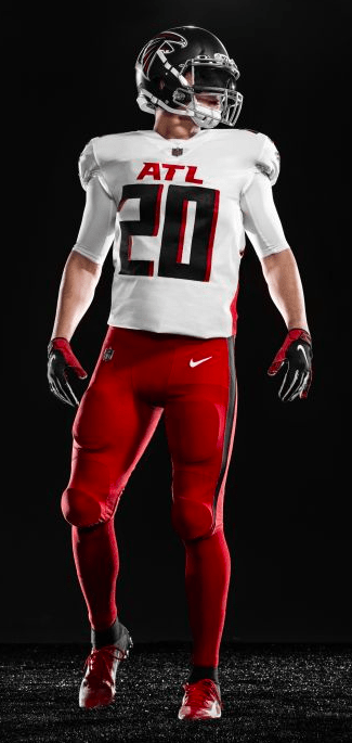
There’s something about Matt Ryan posing in this uniform that says “I’m too old for this ***t” [Atlanta Falcons]
You don’t have to combine all of the color options…
Undoubtedly, the Falcons were in desperate need for a change from the awkward color-blocking and over-thought number font that first debuted on 2003’s arena-esque look. At the time, the new look was viewed as a radical change from their classic solid-color look made famous by Jamaal Anderson and the timeless “Dirty Bird Dance“, with the new Falcon logo being the only universally well-received change.
The refreshed 2020 look is a near-complete overhaul, no longer relying on piping and color-blocking to add over-the-top features to an already bold color palette. The simplicity of the understated red side panels is a clean look that works well with all black/white top and bottom combinations. Even the faded red-to-black jersey takes care not to add too much visual stimulation while still offering a distinct yet fully-cohesive setup.
“ATL” prominently displayed on the front of the primary looks is a bit of a reach for “cool” points, while the contrasting shadow numbers only make the unique font harder to read. Add the alternate red pants into the mix and you have a visual mess that is too option-focused. The saving grace of this release is the throwback look, complete with alternate Falcon helmet decal and matching shoulder detail. Three-stripe pants and standard full-block numbers are the best look in the teams 50+ year history; hopefully they give us a matching throwback white jersey in the future and send the “ATL” kits packing.
Grade: C
New England Patriots
How much change can Patriots fans handle in one off-season? [New England Patriots]
Is it a coincidence that the Navy/Silver Patriots uniforms debuted during Tom Brady’s rookie year, and were subsequently retired after his last season in New England? It seems wholly appropriate to close this dynastic chapter of Patriots history with the retirement of the winningest uniform in NFL history (*AngrySteelersFan79 has entered the chat*).
Unlike the other big uniform upgrades coming in 2020, the classically-conservative Patriots are simply promoting their navy-on-navy Color Rush look to primary status. From 1960 to 1992, shoulder striping was a hallmark of the Boston/New England on-field look, so it
Will we ever see the Red AFL Throwback Jerseys again? Let’s hope so. [New England Patriots]
should come as no surprise to true Patriots fans that the distinct detailing is making a comeback. Navy Blue as a primary color when detailed with scarlet accents always results in a clean, easy-on-the-eyes, patriotic look as long as white is used as the main contrasting color. These home uniforms continue to convey a professional, buttoned-up look, perhaps more than the 2000/2010’s uniforms. The new away jersey however is a puzzling, lazy offering that looks as though designers clicked the “randomize” button in their design program. The Red-Navy-Red arrangement on the shoulder stripe doesn’t fit well with the number coloring nor does it complement the singular pant option that works so well with the home jersey. The late 80’s/early 90’s white jerseys at least broke the dark-on-dark striping up with thin white lining. Any emphasis on the color red within the Patriot scheme should be reserved for the iconic red-top uniforms of the 60’s, 70’s, 80’s and early 90’s. While uninventive, the navy set still scores points – but the white jerseys need fixing as soon as possible.
Grade: C–
Cleveland Browns
New Old Style, Same Old Browns [Cleveland Browns]
The Cleveland Browns for decades have been the Masters of Mishap, authoring chapter and verse on what not to do when trying to build a winning sports franchise. With a list of misfortunes longer than the list of starting quarterbacks since 1999, the one aspect of the Browns that wasn’t ranked 32 out of 32 was their classic uniform look that dates back to the Jim Brown era. Like clockwork, this last bastion of positivity eventually proved equally susceptible to the oft-overthinking Browns brain-trust and their poor decision making skills. Cleveland’s 2015 uniform overhaul introduced us to a radical, over-modernized busy arrangement, appropriately comparable to what an over-hyped FCS-level college program would wear.
Thankfully someone in Cleveland realized that it’s time to unfix what wasn’t broken, and bring back the timeless look that has defined the Browns since their inception in 1946. Brown and Orange is a surprisingly symbiotic color combination that works in almost any striping arrangement. Never again should there be any less than five stripes on the
“BROWNS” on the sides of their pants was a worse decision than drafting Johnny Football
shoulder of a Browns uniform, as few teams could pull off the look this effortlessly. The uniqueness of the color combination negates the need for a team name, especially on pants (something no team should ever try again). The one decent look from last year, the all-brown Color Rush alternate, is worthy of inclusion as an alternate to the primary setups as long as they maintain the solid orange decoration and resist throwing white into the mix. We know however, that nothing is sacred in Cleveland.
Grade: B-
Indianapolis Colts
Seems like a waste of a graphic. [Indianapolis Colts]
Nothing newsworthy has come out of Indianapolis since Andrew Luck shocked the professional football world and hung up the cleats after the 2018 season. In appropriately quiet fashion, the Colts will roll out minor updates to their standard Royal and White branding. Only those looking closely will notice the number font change, meant to match the old uniform numbers from the 50’s and 60’s. A new secondary logo with a questionable origin story will also appear randomly and seemingly stay out of sight on actual player gear. But wait! A new color – “Anvil Black” – has been introduced into the color scheme, and used ONLY in the Nike swoosh on the white away uniforms. Yawn.
Grade: D+
Bonus: Los Angeles Rams
Hopefully the logo designers aren’t in charge of the new uniforms. [Los Angeles Rams]
EDIT: The 2020 Rams uniforms earned an entire post of their own – find it here.
On the plus side, shifting to Royal and Gold primary colors finally sheds all the confusion that has surrounded the Rams identity over the past decade or so. On the negative side, ANY uniform combination that they release will fail to live up to the standard set by the Chargers’ new 2020 threads. There’s a good chance someone on the Rams design team caught a glimpse of the Chargers uniforms before they went public, and took their concepts back to the drawing board. We’ll revisit this once the Rams uniforms drop.
My name is Josh Tullis – thank you for making it this far.
For as long as I can competently do so, I’ll be using this platform to share some insights and breakdowns on sports uniforms, gear, equipment and footwear from the perspective of what I call a “Ghost” of the industry. Most people outside of the industry think you can pick up the phone and call an Under Armour or Nike if you need gear…not the case.
For years I’ve struggled with the same basic question: “What do you do?” I’ve never answered the question the same way. If I had just listened to my mother’s advice 12+ years ago, this would be an easier exercise – “Eye Surgeon” or “Accountant” has a clear palpability. Instead, you’d most likely be met with some version of “Well, I sell team uniforms and equipment to college, high school and club sports programs.” More than six syllables and you’re most likely checked out. That’s why over time, I’ve adopted the shortened, simple job description that clients tend to use when introducing me to their own colleagues: “The Uniform Guy”. It might not be as smooth as the mononymous “Pelé”, but I’ll take it.
Pelé was born “Edson Arantes Do Nascimento” – imagine putting that on the back of a jersey…
Depending on the building I’m in, the tag could vary. At the end of the day, I don’t care if you land on the “Uniform Guy”, the “Nike Guy”, the “Adidas Guy”, and so on. In my opinion, the KISS Method is severely underrated in this industry, and all that matters is that I’m the guy.
Right now, if you google “The Uniform Guy”, you’ll encounter a lovely small business in Canton, Ohio specializing in medical, dental and hospitality uniforms. It took Homer only 22 minutes of run-time to establish the eternal name recognition of “Mr. Plow”….I guess I have some work to do if I’ll make it to the top of the Google Insights food-chain.
In the meantime, I’ve decided that I’m qualified enough to open up this gear talk after years of sitting in product meetings, outfitting a very diverse base of athletic programs, and most recently – sitting in quarantine for too long. I encourage outside thoughts and perspectives, both affirming and contrary.
Welcome to all gear nerds and sportswear enthusiasts – I promise this will be the last self-serving post.


![We're still fond of the Bucs' new threads, but they're not quite at the top of the NFL when it comes to uniform redesigns. [Tampa Bay Buccaneers]](https://arc-anglerfish-arc2-prod-tbt.s3.amazonaws.com/public/WUBJ5RZIH5CMXBN5DKUOSMJULM.jpg)


/cdn.vox-cdn.com/uploads/chorus_image/image/66553331/154839575.jpg.0.jpg)